February 10th, 2016
We’ve been getting a few questions lately asking how implemented the new “gauge” charts that are embedded within the Status Hero reports. If you haven’t seen them yet, you can see them in action on our home page or Slack integration page.
The result is pretty close to what we envisioned, but we had to work around a couple of issues for the charts to “feel” right and animate properly.
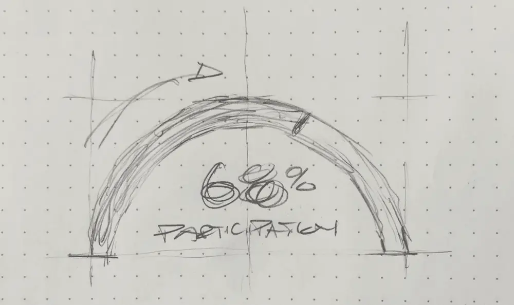
We started with a sketch of what we wanted and took a look at the charting/graphing libraries out there. Unfortunately nothing really hit the mark - we weren’t trying for the ‘speedometer’ look, which is what Google, HighCharts and the others seem to offer in this category. D3 and Rapheal were also options, but we thought they would add too much bloat to the app for such a simple effect.

Because we wanted the look to be simple and clean without a lot of flourish and decoration, we thought we could easily build the charts from scratch in SVG. All modern browsers support it, we can size things infinitely, and style as we please with CSS.
However, we had a couple of hurdles to jump. First, SVG does not have an arc basic shape. You have to build it yourself out of a parametric path, so you get something that looks like this:

The code for that looks like this:
The math got tricky here, but we finally cobbled together some javascript to produce a path for an arc-sweep to match the percentage displayed in the chart:
polar_to_cartesian = function(cx, cy, radius, angle) { var radians; radians = (angle - 90) * Math.PI / 180.0; return [Math.round((cx + (radius * Math.cos(radians))) * 100) / 100, Math.round((cy + (radius * Math.sin(radians))) * 100) / 100]; };
svg_arc_path = function(x, y, radius, start_angle, end_angle) { var end_xy, start_xy; start_xy = polar_to_cartesian(x, y, radius, end_angle); end_xy = polar_to_cartesian(x, y, radius, start_angle); return "M " + start_xy[0] + " " + start_xy[1] + " A " + radius + " " + radius + " 0 0 0 " + end_xy[0] + " " + end_xy[1]; };
The other problem was that we wanted to add a bit of animation to the chart - the sweep effect of the arc and the percentage climbing to their final destination. Unfortunately, SMIL, SVG’s native animation specification, is not widely supported. Bummer.
Luckily, there’s an excellent and well-maintained javascript library for this: Snap.svg. By hooking our SVG elements up to Snap’s .animate functionality, we can make our arcs sweep across with easing and other animation niceties that you might find in jQuery. (In fact, Snap describes themselves as “jQuery or Zepto for SVG”.) The code was relatively straightforward given the quality of Snap’s docs:
animate_arc = function(ratio, svg) { var arc, center, radius, startx, starty; arc = svg.path(‘’); center = 500; radius = 450; startx = 0; starty = 450; return Snap.animate(0, ratio, (function(val) { var path; arc.remove(); path = svg_arc_path(500, 500, 450, -90, val * 180.0 - 90); arc = svg.path(path); }), Math.round(2000 * ratio), mina.easeinout); };
So finally our charts animate on page load and end up looking like this:
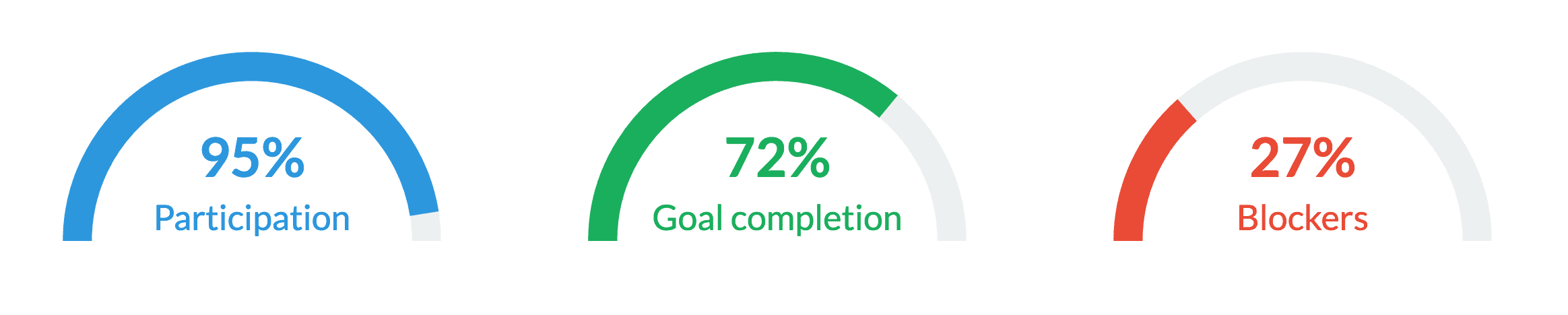
Here’s a CodePen demonstrating the effect along with all of the source code we used.